自定义组件
1. 创建-注册-使用组件
组件介绍
小程序目前已经支持组件化开发,可以将页面中的功能模块抽取成自定义组件,以便在不同的页面中重复使用;
也可以将复杂的页面拆分成多个低耦合的模块,有助于代码维护。
开发中常见的组件有两种:
- 公共组件:将页面内的功能模块抽象成自定义组件,以便在不同的页面中重复使用
- 页面组件:将复杂的页面拆分成多个低耦合的模块,有助于代码维护
如果是公共组件,建议将其放在小程序的目录下的 components 文件夹中
如果是页面组件,建议将其放在小程序对应页面目录下,当然你也可以放到页面的 components 文件夹中
同时建议:一个组件一个文件夹,文件夹名称和组件名称保持一致
📌 注意事项:
- 自定义组件的需要在
json 文件中需要配置 component 字段设为 true
- 自定义组件通过
Component 构造器进行构建,在构造器中可以指定组件的属性、数据、方法等
创建自定义组件:
创建组件的步骤很简单,以公共组件为例,创建的步骤如下:
在小程序的目录下新建 components 文件夹
在 components 文件夹上,点击右键,选择新建文件夹 ,然后输入文件夹名称,我们建议文件夹的名称和组件的名称保持一致,这样方便后期对组件进行维护。我们这里新的的组件名称叫做:custom-checkbox
在新建的组件文件夹上,点击右键,选择新建 Component,然后输入组件的名称,组件的名称建议和文件夹保持一致
此时就已经创建了一个功能组件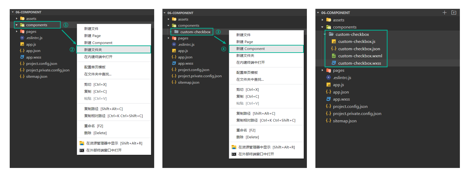
使用自定义组件
开发中常见的组件主要分为 公共组件 和 页面组件 两种,因此注册组件的方式也分为两种:
- 全局注册:在
app.json 文件中配置 usingComponents 节点进行引用声明,注册后可在任意组件使用
- 局部注册:在页面的
json 文件中配置 usingComponents 节点进行引用声明,只可在当前页面使用
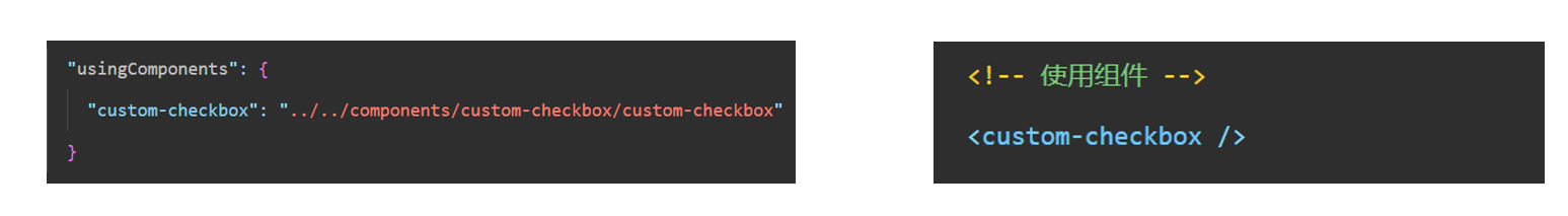
在配置 usingComponents 节点进行引用声明时,需要提供自定义组件的标签名和对应的自定义组件文件路径,语法如下:
1
2
3
4
5
| {
"usingComponents": {
"自定义组件的标签名": "自定义组件文件路径"
}
}
|
这样,在页面的 wxml 中就可以像使用基础组件一样使用自定义组件。节点名即自定义组件的标签名,节点属性即传递给组件的属性值。
1
2
3
4
5
| {
"usingComponents": {
"custom-checkbox": "/components/custom-checkbox/custom-checkbox"
}
}
|
1
2
3
4
5
6
7
8
|
<view>
<custom-checkbox
/>
</view>
|
2. 自定义组件-数据和方法
在组件的 .js 中,需要调用 Component 方法创建自定义组件,Component 中有以下两个属性:
data 数据:组件的内部数据
methods 方法:在组件中事件处理程序需要写到 methods 中才可以
落地代码:
➡️ components/custom-checkbox/custom-checkbox.wxml
1
2
3
4
5
6
7
8
|
<view class="custom-checkbox-container">
<view class="custom-checkbox-box">
<checkbox checked="{{ isChecked }}" bindtap="updateChecked" />
</view>
</view>
|
➡️ components/custom-checkbox/custom-checkbox.wxss
1
2
3
4
5
|
.custom-checkbox-container {
display: inline-block;
}
|
➡️ components/custom-checkbox/custom-checkbox.js
1
2
3
4
5
6
7
8
9
10
11
12
13
14
15
16
17
18
19
20
21
22
23
24
25
26
27
| Component({
data: {
isChecked: false
},
methods: {
updateChecked () {
this.setData({
isChecked: !this.data.isChecked
})
console.log(this.data.isChecked)
}
}
})
|
➡️ app.json
1
2
3
4
5
| {
"usingComponents": {
"custom-checkbox": "./components/custom-checkbox/custom-checkbox"
}
}
|
➡️ index.wxml
1
2
3
4
5
6
| <custom-checkbox />
<view class="line"></view>
<custom-checkbox />
|
3. 自定义组件-属性
属性 Properties 是指组件的对外属性,主要用来接收组件使用者传递给组件内部的数据,和 data 一同用于组件的模板渲染
📌 注意事项:
- 设置属性类型需要使用 type 属性,属性类型是必填项,value 属性为默认值
- 属性类型可以为 String、Number、Boolean、Object、Array ,也可以为 null 表示不限制类型
落地代码:
➡️ index.wxml
1
2
3
4
5
6
7
8
9
|
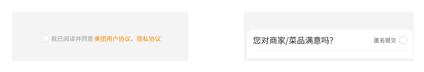
<custom-checkbox label="我已阅读并同意 用户协议 和 隐私协议" position="right" />
<view class="line"></view>
<custom-checkbox label="匿名提交" position="left" />
|
➡️ components/custom-checkbox/custom-checkbox.wxml
1
2
3
4
5
6
7
8
9
10
11
12
13
|
<view class="custom-checkbox-container">
+ <view class="custom-checkbox-box {{ position === 'right' ? 'right' : 'left' }}">
+ <checkbox class="custom-checkbox" checked="{{ isChecked }}" bindtap="updateChecked" />
+
+ <view>
+ <text>{{ label }}</text>
+ </view>
</view>
</view>
|
➡️ components/custom-checkbox/custom-checkbox.wxss
1
2
3
4
5
6
7
8
9
10
11
12
13
14
15
16
17
18
19
20
21
22
23
|
.custom-checkbox-container {
display: inline-block;
}
.custom-checkbox-box {
display: flex;
align-items: center;
}
.custom-checkbox-box.left {
flex-direction: row-reverse;
}
.custom-checkbox-box.right {
flex-direction: row;
}
.custom-checkbox {
margin-left: 10rpx;
}
|
➡️ components/custom-checkbox/custom-checkbox.js
1
2
3
4
5
6
7
8
9
10
11
12
13
14
15
16
17
18
19
20
21
22
23
24
25
26
27
28
29
30
31
32
33
34
35
36
37
38
39
40
41
42
43
44
45
46
47
48
49
50
51
52
53
| Component({
+
+ properties: {
+
+
+
+ label: {
+
+
+
+ type: String,
+ value: ''
+ },
+
+
+ position: {
+ type: String,
+ value: 'right'
+ }
+ },
data: {
isChecked: false
},
methods: {
updateChecked () {
this.setData({
isChecked: !this.data.isChecked,
+
})
+
+
+
}
}
})
|
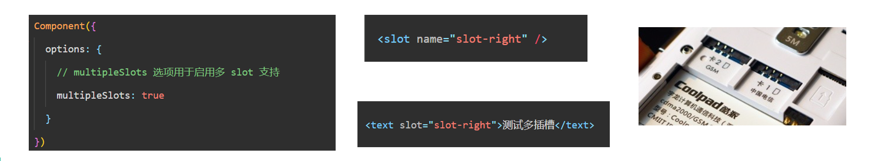
4. 组件 wxml 的 slot
在使用基础组件时,可以给组件传递子节点传递内容,从而将内容展示到页面中,自定义组件也可以接收子节点内容
只不过在组件模板中需要定义 <slot /> 节点,用于承载组件引用时提供的子节点
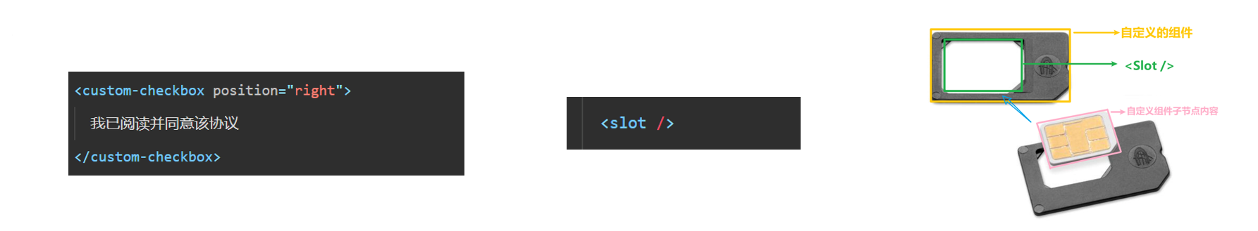
默认情况下,一个组件的 wxml 中只能有一个 slot 。需要使用多 slot 时,可以在组件 js 中声明启用。
同时需要给 slot 添加 name 来区分不同的 slot,给子节点内容添加 slot 属性来将节点插入到 对应的 slot 中
知识点讲解:
➡️ custom01.html
1
2
3
4
5
6
7
8
9
| <view>
<slot name="slot-top" />
<view><slot /></view>
<slot name="slot-bottom" />
</view>
|
➡️ custom01.js
1
2
3
4
5
6
7
8
9
10
|
Component({
options: {
multipleSlots: true
}
})
|
➡️ cart.wxml
1
2
3
4
5
6
7
8
9
10
| <custom01>
<text slot="slot-top">我需要显示到顶部</text>
我是子节点内容
<text slot="slot-bottom">我需要显示到低部</text>
</custom01>
|
完善复选框案例
➡️ custom-checkbox.html
1
2
3
4
5
6
7
8
9
10
11
12
13
14
15
16
17
18
19
|
<view class="custom-checkbox-container">
<view class="custom-checkbox-box {{ position === 'right' ? 'right' : 'left' }}">
<checkbox class="custom-checkbox" checked="{{ isChecked }}" bindtap="updateChecked" />
+ <view>
+
+
+
+
+ <text wx:if="{{ label !== '' }}">{{ label }}</text>
+
+ <slot wx:else />
+ </view>
</view>
</view>
|
➡️ index.html
1
2
3
4
5
6
7
8
9
10
11
12
|
<custom-checkbox label="我已阅读并同意 用户协议 和 隐私协议" position="right">
我已阅读并同意 用户协议 和 隐私协议 - 111
</custom-checkbox>
<view class="line"></view>
<custom-checkbox label="匿名提交" position="left">
匿名提交 - 222
</custom-checkbox>
|
5. 组件样式以及注意事项
选择器使用注意事项:
类似于页面,自定义组件拥有自己的 wxss 样式,组件对应 wxss 文件的样式,只对组件wxml内的节点生效。
编写组件样式时,需要注意以下几点:
app.wxss 或页面的 wxss 中使用了标签名(view)选择器(或一些其他特殊选择器)来直接指定样式
这些选择器会影响到页面和全部组件,通常情况下这是不推荐的做法
组件和引用组件的页面不能使用 id 选择器(#a)、属性选择器([a]) 和 标签名选择器,请改用 class 选择器
组件和引用组件的页面中使用后代选择器(.a .b)在一些极端情况下会有非预期的表现,如遇,请避免使用
子元素选择器(.a>.b)只能用于 view 组件与其子节点之间,用于其他组件可能导致非预期的情况。
继承样式,如 font 、 color ,会从组件外继承到组件内。
除继承样式外, 全局中的样式、组件所在页面的的样式对自定义组件无效 (除非更改组件样式隔离选项)
1
2
3
4
| #a { }
[a] { }
button { }
.a > .b { }
|
落地代码:
➡️ custom02.wxml
1
2
3
| <text id="content" class="content son">
<text class="label">给自定义组件设置样式</text>
</text>
|
➡️ custom02.wxss
1
2
3
4
5
6
7
8
9
10
11
12
13
14
15
16
17
18
19
20
21
22
23
24
25
26
27
28
29
30
31
32
33
34
35
36
37
38
|
|
➡️ cate.wxml
1
2
3
4
5
6
7
| <view class="custom parent">
<view>
<custom02 />
<view class="son test">我是父级页面中的结构</view>
</view>
</view>
|
➡️ cate.wxss
1
2
3
4
5
6
7
8
9
10
11
12
13
14
15
16
17
18
|
.parent .son.test {
color: lightsalmon;
}
|
➡️ app.wxss
6. 组件样式隔离
默认情况下,自定义组件的样式只受到自定义组件 wxss 的影响。除非以下两种情况:
app.wxss 或页面的 wxss 中使用了标签名(view)选择器(或一些其他特殊选择器)来直接指定样式,这些选择器会影响到页面和全部组件。通常情况下这是不推荐的做法。
指定特殊的样式隔离选项 styleIsolation
1
2
3
4
5
| Component({
options: {
styleIsolation: 'isolated'
}
})
|
styleIsolation 选项它支持以下取值:
isolated 表示启用样式隔离,在自定义组件内外,使用 class 指定的样式将不会相互影响(一般情况下的默认值);apply-shared 表示页面 wxss 样式将影响到自定义组件,但自定义组件 wxss 中指定的样式不会影响页面;shared 表示页面 wxss 样式将影响到自定义组件,自定义组件 wxss 中指定的样式也会影响页面和其他设置了 apply-shared 或 shared 的自定义组件。
落地代码:
➡️ custom03.wxml
1
2
3
|
<text class="label">演示组件样式隔离</text>
|
➡️ custom03.wxss
1
2
3
4
5
6
|
.test {
color: lightseagreen;
font-size: 50rpx;
}
|
➡️ custom03.js
1
2
3
4
5
6
7
8
9
10
11
12
13
14
15
16
17
18
19
20
21
22
|
Component({
options: {
styleIsolation: 'shared'
}
})
|
➡️ cate.wxml
➡️ cate.wxss
1
2
3
| .label {
color: lightsalmon;
}
|
7. 拓展-小程序修改checkbox样式
知识点:
技巧:在官方文档,找到官方提供的案例,审查元素,就能看到对应的类名
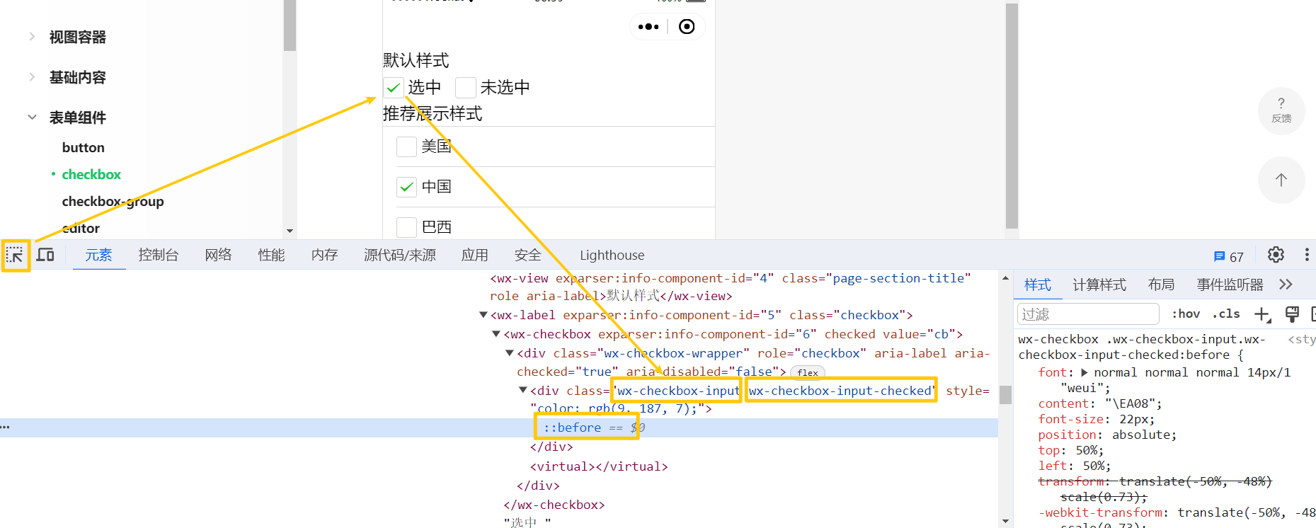
📌 注意事项
- .custom-checkbox .wx-checkbox-input {}:复选框没有选中时默认的样式
- .custom-checkbox .wx-checkbox-input-checked {}: 复选框选中时默认的样式
- .custom-checkbox .wx-checkbox-input.wx-checkbox-input-checked:before {}:复选框选中时 √ 样式
这几个类名,在全局样式文件、页面样式文件都可以对修改复选框样式,
但是在自定义组件内部使用的时候,需要添加 styleIsolation: 'shared' 属性
落地代码:
➡️ components/custom-checkbox/custom-checkbox.wxss
1
2
3
4
5
6
7
8
9
10
11
12
13
14
15
16
17
18
19
20
21
22
23
24
25
26
27
28
29
30
31
32
33
34
35
36
37
38
|
.custom-checkbox .wx-checkbox-input {
width: 24rpx !important;
height: 24rpx !important;
border-radius: 50% !important;
border: 1px solid #fda007 !important;
margin-top: -6rpx;
}
.custom-checkbox .wx-checkbox-input-checked {
background-color: #fda007 !important;
}
.custom-checkbox .wx-checkbox-input.wx-checkbox-input-checked:before {
font-size: 22rpx;
color: #fff;
}
|
➡️ components/custom-checkbox/custom-checkbox.js
1
2
3
4
5
6
7
| Component({
options: {
styleIsolation: 'shared'
}
})
|
➡️ index.wxss
1
2
3
4
5
6
7
8
9
|
.custom .custom-checkbox .wx-checkbox-input {
border: 1px solid lightseagreen !important;
}
.custom .custom-checkbox .wx-checkbox-input-checked {
background-color: lightseagreen !important;
}
|
8. 数据监听器
知识点:
数据监听器可以用于监听和响应任何属性和数据字段的变化,有时,需要在一些数据字段被 setData 设置时,需要执行一些操作。那么就可以使用 observers 数据监听器来实现。语法如下:
1
2
3
4
5
6
7
8
9
10
11
12
13
14
15
16
17
18
19
20
21
22
23
24
25
26
27
28
29
30
31
32
| Component({
data: {
num: 10,
count: 1,
obj: { name: 'Tom', age: 10 },
arr: [1, 2, 3]
},
observers: {
num: function(newNum) {
console.log(newNum)
},
'num, count': function (newNum, newCount) {
console.log(newNum, newCount)
}
'obj.age': function(newAge) {
console.log(newAge)
},
'obj.**': function(newAge) {
console.log(newAge)
},
'arr[0]': function (val) {}
}
})
|
9. 组件间通信与事件
9.1 父往子传值
知识点:
父组件如果需要向子组件传递指定属性的数据,在 WXML 中需要使用数据绑定的方式
与普通的 WXML 模板类似,使用数据绑定,这样就可以向子组件的属性传递动态数据。
父组件如果需要向子组件传递数据,只需要两个步骤:
1.在父组件 WXML 中使用 数据绑定 的方式向子组件传递动态数据
2.子组件内部使用 properties 接收父组件传递的数据即可
知识点代码:
1
2
3
4
|
<view>
<costom prop-a="{{ name }}" prop-b="{{ age }}" />
</view>
|
在组件内部,需要在 Component 构造器中通过 properties 接收传递的数据,接收方式有两种:
1
2
3
4
5
6
7
8
9
10
11
12
13
14
15
| Component({
properties: {
propA: {
type: String,
value: ''
},
propB: Number
},
})
|
在子组件中也可以通过 this.setData() 对 properties 中的数据进行修改,但是一般不建议修改
1
2
3
4
5
6
7
8
9
10
11
12
13
14
15
16
|
Component({
methods: {
updateProp () {
this.setData({
propB: this.properties.propB + 1
})
}
}
})
|
复选框组件案例:
➡️ index.js
1
2
3
4
5
6
7
8
9
| Page({
data: {
isChecked: true
},
})
|
➡️ index.wxml
1
2
3
4
5
6
| <custom-checkbox
label="我已阅读并同意 用户协议 和 隐私协议"
position="right"
+ checked="{{ isChecked }}">
我已阅读并同意 用户协议 和 隐私协议 - 111
</custom-checkbox>
|
➡️ components/custom-checkbox/custom-checkbox.js
1
2
3
4
5
6
7
8
9
10
11
12
13
14
15
16
17
18
19
20
21
22
23
24
25
26
27
28
29
30
31
32
33
34
35
36
37
38
39
40
41
42
43
44
45
46
47
48
49
50
51
52
53
54
55
56
57
58
59
60
61
62
63
| Component({
options: {
styleIsolation: 'shared'
},
properties: {
+ checked: {
+ type: Boolean,
+ value: false
+ }
},
data: {
isChecked: false
},
+ observers: {
+
+
+ checked: function (newChecked) {
+
+ this.setData({
+ isChecked: newChecked
+ })
+ }
+ },
methods: {
updateChecked () {
this.setData({
+ isChecked: !this.data.isChecked,
+
})
}
}
})
|
➡️ components/custom-checkbox/custom-checkbox.wxml
1
2
3
4
5
6
7
8
9
10
11
12
13
14
15
16
17
18
19
|
<view class="custom-checkbox-container">
<view class="custom-checkbox-box {{ position === 'right' ? 'right' : 'left' }}">
+ <checkbox class="custom-checkbox" checked="{{ isChecked }}" bindtap="updateChecked" />
<view class="content">
<text wx:if="{{ label !== '' }}">{{ label }}</text>
<slot wx:else />
</view>
</view>
</view>
|
9.2 子往父传值
子组件如果需要向父组件传递数据,可以通过小程序提供的事件系统实现传递传递,可以传递任意数据。
事件系统是组件间通信的主要方式之一,自定义组件可以触发任意的事件,引用组件的页面可以监听这些事件,流程如下:
- 自定义组件触发事件时,需要使用
triggerEvent 方法发射一个自定义的事件
- 自定义组件标签上通过 bind 方法监听发射的事件
触发事件:
1
2
|
<button type="primary" plain bindtap="sendData">传递数据</button>
|
1
2
3
4
5
6
7
8
9
10
11
12
13
14
15
16
17
18
19
20
21
22
23
|
Component({
data: {
num: 666
},
methods: {
sendData () {
this.triggerEvent('myevent', this.data.num)
}
}
})
|
监听事件:
1
2
3
| <view>{{ num }}</view>
<custom05 bind:myevent="getData" />
|
1
2
3
4
5
6
7
8
9
10
11
12
13
14
15
16
| Page({
data: {
num: ''
},
getData (event) {
this.setData({
num: event.detail
})
}
})
|
复选框组件案例:
➡️ components/custom-checkbox/custom-checkbox.js
1
2
3
4
5
6
7
8
9
10
11
12
13
14
15
16
17
18
19
20
21
22
23
24
25
26
27
28
29
30
31
| Component({
methods: {
updateChecked () {
this.setData({
isChecked: !this.data.isChecked,
})
+
+
+
+
+
+ this.triggerEvent('changechecked', this.data.isChecked)
}
}
})
|
➡️ index.html
1
2
3
4
5
6
7
8
9
| <custom-checkbox
label="我已阅读并同意 用户协议 和 隐私协议"
position="right"
checked="{{ isChecked }}"
class="getchild"
+ bind:changechecked="getData"
>
我已阅读并同意 用户协议 和 隐私协议 - 111
</custom-checkbox>
|
➡️ index.js
1
2
3
4
5
6
7
8
9
10
11
12
13
14
15
16
17
| Page({
data: {
isChecked: true
},
getData (event) {
console.log(event.detail)
if (event.detail) {
console.log('提交')
} else {
console.log('请同意协议!')
}
}
})
|
9.3 获取组件实例
如果前面两种方式不足以满足需要。
可在父组件里调用 this.selectComponent() ,获取子组件的实例对象,就可以直接拿到子组件的任意数据和方法。调用时需要传入一个匹配选择器 selector,如:this.selectComponent(".my-component")。
1
2
3
|
<costom bind:myevent="getData" class="custom" />
<button bindtap="getChildComponent"></button>
|
1
2
3
4
5
6
7
8
|
Page({
data: {},
getChildComponent: function () {
const child = this.selectComponent('.custom')
console.log(child)
}
})
|
复选框组件案例:
➡️ index.html
1
2
3
4
5
6
7
8
9
10
11
12
13
| <custom-checkbox
label="我已阅读并同意 用户协议 和 隐私协议"
position="right"
checked="{{ isChecked }}"
+ class="child"
+ id="child"
bind:changechecked="getData"
>
我已阅读并同意 用户协议 和 隐私协议 - 111
</custom-checkbox>
<button type="primary" plain bindtap="getChild">获取子组件实例对象</button>
|
➡️ index.js
1
2
3
4
5
6
7
8
9
10
11
12
13
14
15
| Page({
getChild () {
const res = this.selectComponent('#child')
console.log(res.data.isChecked)
}
})
|
10. 组件生命周期
组件的生命周期:指的是组件自身的一些钩子函数,这些函数在特定的时间节点时被自动触发
组件的生命周期函数需要在 lifetimes 字段内进行声明
最重要的生命周期是 created attached detached 包含一个组件生命周期流程的最主要时间点
| 定义段 |
描述 |
created |
在组件实例刚刚被创建时执行,注意此时不能调用 setData (还没有对模板解析) |
attached |
在组件实例进入页面节点树时执行 (模板已经解析完毕,并且挂载到页面上) |
| ready |
在组件布局完成后执行 |
| moved |
在组件实例被移动到节点树另一个位置时执行 |
detached |
在组件实例被从页面节点树移除时执行 (组件被销毁了) |
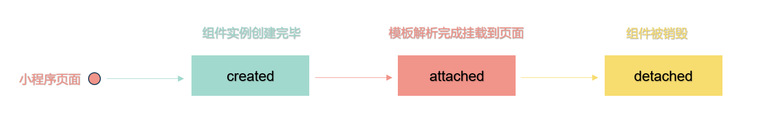
【组件实例刚刚被创建好时】, created 生命周期被触发。此时,组件数据 this.data 就是在 Component 构造器中定义的数据 data 。 此时还不能调用 setData 。 通常情况下,这个生命周期只应该用于给组件 this 添加一些自定义属性字段。
【在组件完全初始化完毕】、进入页面节点树后, attached 生命周期被触发。此时, this.data 已被初始化为组件的当前值。这个生命周期很有用,绝大多数初始化工作可以在这个时机进行。
【在组件离开页面节点树后】, detached 生命周期被触发。退出一个页面时,如果组件还在页面节点树中,则 detached 会被触发。
1
2
3
4
5
6
7
8
9
10
11
12
13
14
15
16
17
18
19
20
21
| Component({
lifetimes: {
created: function () {
},
attached: function() {
},
detached: function() {
},
}
})
|
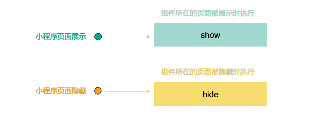
11. 组件所在页面的生命周期
组件还有一些特殊的生命周期,这类生命周期和组件没有很强的关联
主要用于组件内部监听父组件的展示、隐藏状态,从而方便组件内部执行一些业务逻辑的处理
组件所在页面的生命周期有 4 个: show、 hide、 resize、 routeDone,需要在 pageLifetimes 字段内进行声明
1
2
3
4
5
6
7
8
9
10
11
12
13
14
15
16
17
18
19
20
21
22
|
Component({
pageLifetimes: {
show () {
console.log('组件所在的页面被展示')
},
hide () {
console.log('组件所在的页面被隐藏')
}
}
})
|
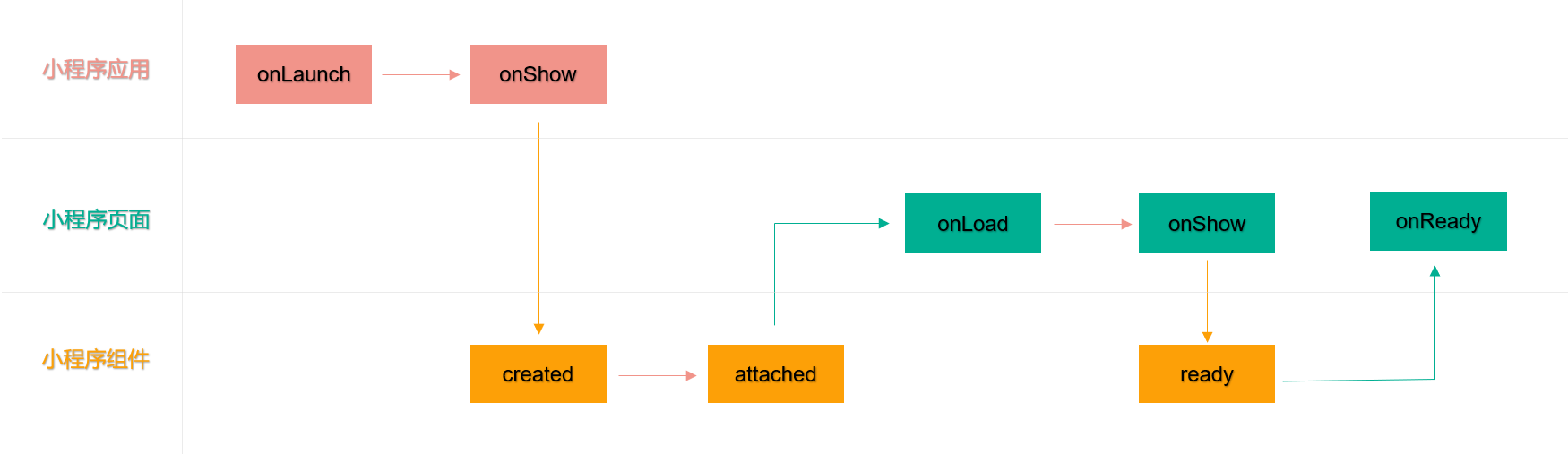
12. 小程序生命周期总结
小程序冷启动,钩子函数执行的顺序
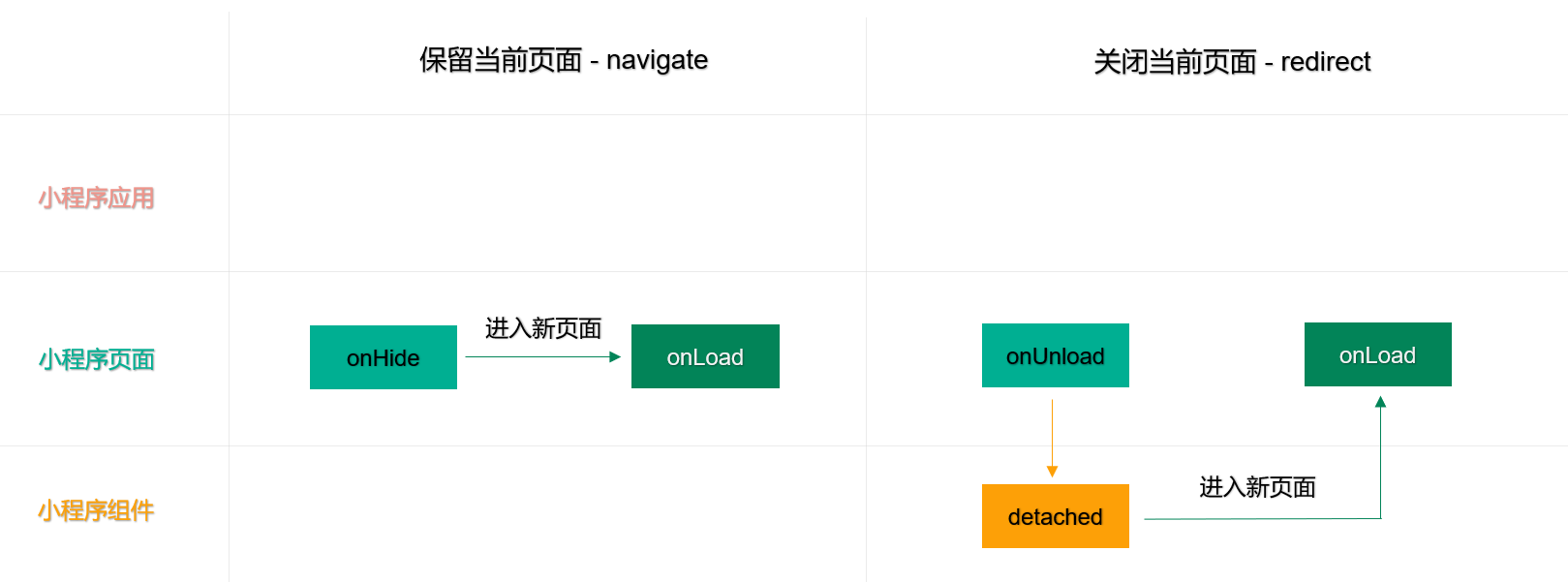
保留当前页面(navigate) 以及 关闭当前页面(redirect)
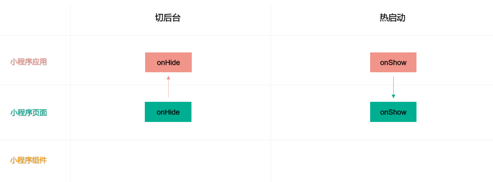
切后台 以及 切前台(热启动)
13. 拓展:使用 Component 构造页面
Component 方法用于创建自定义组件
小程序的页面也可以视为自定义组件,因此页面也可以使用 Component 方法进行创建,从而实现复杂的页面逻辑开发
📌 注意事项:
要求对应 json 文件中包含 usingComponents 定义段
页面使用 Component 构造器创建,需要定义与普通组件一样的字段与实例方法
页面 Page 中的一些生命周期方法(如 onLoad() 等以“on”开头的方法),在 Component 中要写在 methods 属性中才能生效
组件的属性 Properties 可以用于接收页面的参数,在 onLoad() 中可以通过 this.data 拿到对应的页面参数
落地代码:
1
2
3
4
5
6
7
8
9
10
11
12
13
14
15
16
17
18
19
20
21
22
23
24
25
26
27
28
29
30
31
32
33
34
35
36
37
38
39
40
41
42
43
44
45
46
| Component({
properties: {
id: String,
title: String
},
data: {
name: 'tom'
},
methods: {
updateName() {
this.setData({
name: 'jerry'
})
},
onLoad (options) {
console.log(this.data.id)
console.log(this.data.title)
console.log(this.properties.id)
},
}
})
|
14. 拓展:behaviors
小程序的 behaviors 方法是一种代码复用的方式,可以将一些通用的逻辑和方法提取出来,然后在多个组件中复用,从而减少代码冗余,提高代码的可维护性。
如果需要 behavior 复用代码,需要使用 Behavior() 方法,每个 behavior 可以包含一组属性、数据、生命周期函数和方法
组件引用它时,它的属性、数据和方法会被合并到组件中,生命周期函数也会在对应时机被调用。
注册 behavior:
如果需要注册一个 behavior,需要借助 Behavior() 方法,接受一个 Object 类型的参数
1
2
3
4
5
6
7
8
9
10
11
12
13
14
15
16
17
18
19
20
21
22
23
24
25
26
27
28
|
module.exports = Behavior({
behaviors: [],
properties: {
myBehaviorProperty: {
type: String
}
},
data: {
myBehaviorData: 'my-behavior-data'
},
created: function () {
console.log('[my-behavior] created')
},
attached: function () {
console.log('[my-behavior] attached')
},
ready: function () {
console.log('[my-behavior] ready')
},
methods: {
myBehaviorMethod: function () {
console.log('[my-behavior] log by myBehaviorMehtod')
},
}
})
|
使用 behavior:
1
2
3
4
5
6
7
8
|
const myBehavior = require('my-behavior')
Component({
behaviors: [myBehavior]
})
|
组件和它引用的 behavior 中可以包含同名的字段,对这些字段的处理方法如下:
如果有同名的属性或方法,采用 “就近原则”,组件会覆盖 behavior 中的同名属性或方法
如果有同名的数据字段且都是对象类型,会进行对象合并,其余情况会 采用 “就近原则” 进行数据覆盖
生命周期函数和 observers 不会相互覆盖,会是在对应触发时机被逐个调用,也就是都会被执行
详细的规则:同名字段的覆盖和组合规则
15. 拓展:外部样式类
默认情况下,组件和组件使用者之间如果存在相同的类名不会相互影响,组件使用者如果想修改组件的样式,需要就解除样式隔离,但是解除样式隔离以后,在极端情况下,会产生样式冲突、CSS 嵌套太深等问题,从而给我们的开发带来一定的麻烦。
外部样式类:在使用组件时,组件使用者可以给组件传入 CSS 类名,通过传入的类名修改组件的样式。
如果需要使用外部样式类修改组件的样式,在 Component 中需要用 externalClasses 定义若干个外部样式类。
外部样式类的使用步骤:
1.在 Component 中用 externalClasses 定义段定义若干个外部样式类
2.自定义组件标签通过 属性绑定 的方式提供一个样式类,属性是 externalClasses 定义的元素,属性值是传递的类名
3.将接受到的样式类用于自定义组件内部
📌注意事项:
在同一个节点上使用普通样式类和外部样式类时,两个类的优先级是未定义的
因此需要添加 !important 以保证外部样式类的优先级
落地代码:
➡️ custom09.js
1
2
3
4
5
6
|
Component({
externalClasses: ['extend-class']
})
|
➡️ custom09.wxml
1
2
3
4
5
|
<view class="extend-class box">通过外部样式类修改组件的样式</view>
|
➡️ custom09.wxss
1
2
3
| .box {
color: lightseagreen;
}
|
➡️ profile.wxml
1
2
3
|
<custom09 extend-class="my-class" />
|
➡️ profile.wxss
1
2
3
4
5
|
.my-class {
color: lightsalmon !important;
}
|
16. 完善复选框案例并总结自定义组件
总结自定义组件:
组件基本使用:数据、属性、方法、插槽
组件样式使用:组件样式、注意事项、样式隔离、外部样式类
组件通信传值:父往子传值、子往父传值、获取组件实例
组件生命周期:组件的生命周期、组件所在页面的生命周期、总结了小程序全部的生命周期
组件数据监听器:observers
组件拓展:使用 Component 构造页面、组件复用机制 behaviors 等
完善复选框案例
➡️ components/custom-checkbox/custom-checkbox.wxml
1
2
3
4
5
6
7
8
9
10
11
12
13
14
15
16
17
18
19
20
21
|
<view class="custom-checkbox-container">
<view class="custom-checkbox-box {{ position === 'right' ? 'right' : 'left' }}">
+ <label class="custom-label">
<checkbox class="custom-checkbox" checked="{{ isChecked }}" bindtap="updateChecked" />
<view class="content">
<text wx:if="{{ label !== '' }}">{{ label }}</text>
<slot wx:else />
</view>
+ </label>
</view>
</view>
|
➡️ components/custom-checkbox/custom-checkbox.wxss
1
2
3
4
5
| + .custom-checkbox-box .custom-label {
display: flex;
align-items: center;
}
|